Can you find the glitch in the logo of the Netflix film ‘Blonde’?
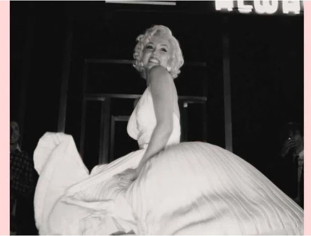
Although actor Ana de Armas’ Netflix film ‘Blonde’ is being produced with a budget of over 22 million, fans couldn’t understand why there was a glitch in something as basic as the film’s logo design. Couldn’t the makers of the Marilyn Monroe biopic hire a professional graphic designer? Or was the person on the job just too lazy?
As the official trailer of the Hollywood film dropped on YouTube on Thursday, netizens were quick to point out a blunder in the logo that appears at the end. The “o” and the “n” don’t properly connect in the title ‘Blonde’. “It’s such a beginner’s mistake,” commented a person under a popular Reddit post. “Also, the little “loop” is too far to the right and kinda looks more like an A. but I think that’s a discussion for a whole other sub(ject),” wrote another person.
Another person wrote satirically: “I won’t take this low-hanging opportunity to make a joke by saying whoever made this “logo” had a real blonde moment. I am above that.”
Netizens wondered if the makers were just too “lazy” to notice the mistake before releasing the trailer. “From an art perspective, the composition is completely unbalanced as well. My eye is completely focused on the BL. the rest of the word will process as anything in my mind; I keep reading blinds, blouse, bland, etc.,” wrote another.
It looks like although makers of big-budgeted movies don’t leave any stone unturned when it comes to perfecting every small detail, sometimes mistakes do creep in.
‘Blonde’ is scheduled to be released on September 28 on Netflix.
Watch the trailer here: